An accessible digital graphic makes its important message perceivable without depending on one color, tiny text, a fragile crop, or unexplained imagery. Start by naming the graphic’s purpose and audience. Establish a reading sequence, use real text when the publishing format allows it, verify text and meaningful-object contrast, pair color with labels or shapes, test reduced size and zoom, and document the intended text alternative or adjacent explanation.
To learn and apply the concept, review one real asset from message through final placement instead of memorizing isolated ratios. This checklist is for social graphics, web banners, diagrams, charts, course visuals, thumbnails, and downloadable assets. It helps a designer prepare evidence and a usable handoff, but it does not certify a website, app, or document against every accessibility requirement. The final implementation, surrounding content, interaction, code, and assistive-technology behavior must also be reviewed.
Write The Message Before Styling
State the single message a viewer must receive and the action, if any, the graphic supports. Separate essential content from atmosphere. If removing an icon, texture, or photograph would not change understanding, label it decorative in the handoff. If removing it would remove meaning, identify the exact information that needs an equivalent text form.
List likely contexts: a wide desktop page, narrow phone, social feed, projector, printed sheet, dark mode, or a compressed thumbnail. A composition that works only at the source canvas is unfinished. Define minimum display size and safe crop behavior before arranging details.
Create A Clear Reading Sequence
Arrange headline, key evidence, labels, and action in a deliberate order. Use position, scale, spacing, and grouping together rather than expecting color alone to establish hierarchy. Keep related labels close to their objects and avoid decorative elements that look like controls, warnings, or data points.
Write the intended reading sequence in plain text. This exposes ambiguity that a sighted designer may overlook. For a process diagram, the text sequence might be trigger, review, decision, result. For a promotional graphic, it might be offer, eligibility, date, action. Make sure the surrounding page can present the same essential information in a logical order.
Keep Important Words As Real Text
When a website or app can render styled text directly, prefer that to baking paragraphs into a bitmap. W3C notes that real text can resize and adapt more reliably than images of text. Logos and essential visual presentations may be exceptions, but a screenshot full of critical copy is difficult to reflow, translate, select, or personalize.
If text must appear inside an exported graphic, preserve the exact copy in the handoff and provide an equivalent adjacent text version. Avoid tiny legal or eligibility information that becomes unreadable at the real placement size. Exporting at more pixels does not fix a design whose text is physically too small.
Verify Text Contrast In Context
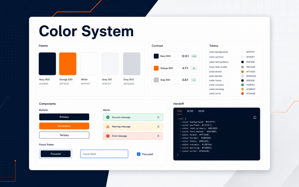
Measure each required text color against its actual background, including photographs, overlays, gradients, and states. Do not sample only the cleanest part of a variable image. WCAG guidance commonly uses at least 4.5:1 for normal text and 3:1 for qualifying large text; confirm the applicable success criterion and size rather than guessing from appearance.
Record foreground, background, ratio, text size, weight, and tool used. Treat shadows and outlines cautiously because they can vary across the letter edge. If a photo creates unstable contrast, use a solid panel, crop, or controlled overlay that keeps every required word legible across responsive placements.
Do Not Encode Meaning With Color Alone
W3C’s use-of-color guidance requires another visual means when color conveys information. Add text labels, patterns, shapes, underlines, positions, or icons with clear meaning. A red and green status pair should also say failed and passed or use distinct symbols. A chart legend should not force viewers to distinguish similar hues without labels.
Check grayscale and common color-vision simulations as diagnostic aids, not as complete accessibility proof. Confirm that the non-color cue remains visible at small size and in print. Brand consistency is valuable, but a brand palette does not override the need to distinguish instructions, states, or data.
Check Meaningful Graphics And Controls
Important boundaries, icons, focus indicators, form components, chart lines, and data shapes may require non-text contrast. W3C’s non-text contrast guidance uses a 3:1 relationship for visual information required to identify components, states, or graphical objects against adjacent colors. Decorative marks that are not needed for understanding are treated differently.
Identify which graphical parts carry meaning before measuring them. A faint grid may be optional while a data line is essential. If contrast cannot be increased without harming the chart, provide labels and a data table or equivalent explanation. Do not claim that adjacent text automatically repairs every inaccessible graphic without checking the actual user task.
Choose Text Alternatives By Purpose
Alternative text should communicate the image’s purpose in its context, not list every visible object. W3C’s images tutorial distinguishes informative, decorative, functional, text, complex, and grouped images. An informative icon may need a short equivalent; a decorative flourish should normally be ignored; a chart may need a concise summary plus detailed data nearby.
Write a draft alternative alongside the design. If one sentence cannot carry all essential meaning, plan adjacent copy, a caption, a table, or a longer description. Avoid starting every alternative with image of. Preserve names and numbers that matter, and do not duplicate adjacent text unless repetition is necessary for the publishing implementation.
Design Charts For Redundant Understanding
Give every chart a clear title and state the takeaway in surrounding text. Label lines, bars, points, or sections directly when space permits. Combine color with pattern, marker shape, line style, or position. Keep legends close and maintain their order across versions.
Provide the underlying values in a structured table when the chart communicates important data. Check units, time ranges, baselines, missing values, and annotation contrast. Do not use a dramatic axis or area effect that changes the perceived relationship. Accessibility includes preserving truthful interpretation, not only making pixels visible.
Test Real Placements And Transformations
Place the asset in its actual component or template. Test desktop and mobile crops, thumbnail size, browser zoom, high contrast settings where applicable, print, and compression. Confirm that the focal subject, labels, and action survive responsive cropping and that no essential content sits inside a platform’s unsafe edge area.
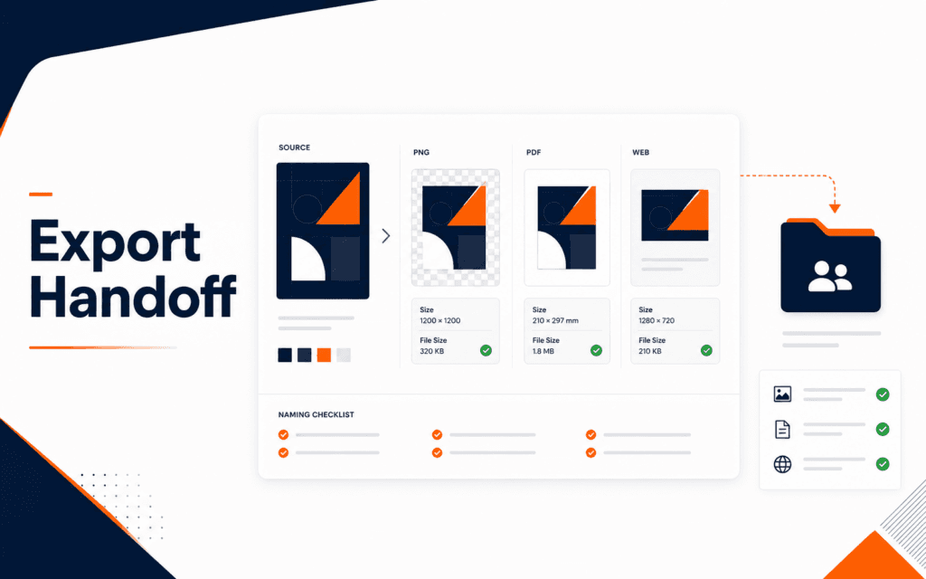
Inspect the exported file rather than trusting the design canvas. Check dimensions, color profile, transparency, file size, sharpening, pixelation, and text rendering. Use SVG for suitable scalable graphics only when the delivery system and security process support it; otherwise choose an appropriate raster or document format and preserve an editable source separately.
Prepare An Accessibility Handoff
Deliver the source asset, exports, placement rules, minimum size, safe area, reading sequence, essential content, decorative elements, text copy, contrast evidence, alt-text recommendation, long-description or data-table requirement, and known limitations. Name the responsible owner for implementing and verifying each item.
Do not tell developers simply to add alt text. Explain the intended purpose and context because the correct alternative may change by placement. A linked logo, informative diagram, and decorative background require different treatment. Include acceptance checks that can be performed in the finished page or document.
Audit A Course-Schedule Graphic
Suppose a square social graphic announces an evening course with subject, start date, days, campus, and admissions action. Mark the subject, schedule, location, and action as essential. Keep those details in accompanying post or page text, use a stable contrast panel behind them, and confirm they remain readable in the platform thumbnail. Decorative laptop imagery does not need to be narrated when it adds no new information.
The handoff should preserve exact copy, safe crop, minimum size, tested color pairs, destination, and context-specific alternative. If the graphic links to admissions, the link name must describe that action outside the bitmap. Test a narrow placement and zoomed page. If a date changes, update both asset and accessible text so visitors do not receive conflicting schedules.
Review With People And Evidence
Automated contrast tools and simulations find some issues, but they do not prove that hierarchy, language, purpose, or alternatives work for people. Include keyboard, zoom, screen-reader, and usability review at the implementation stage, with people with disabilities when feasible and appropriate. Record observed barriers and corrections without collecting unnecessary personal data.
Use the design review checklist for broader hierarchy and typography checks, then retain this accessibility record for the final handoff. A Graphic Design course can strengthen composition and production practice, while accessibility still requires context-specific implementation and verification.
FAQ
Is passing a contrast checker enough?
No. Contrast is one requirement. Also review color-only meaning, reading sequence, real text, image purpose, alternatives, responsive crops, data truthfulness, implementation, and user testing.
Should every image have a detailed alt description?
No. The alternative depends on purpose and context. Decorative images normally use a null alternative, simple informative images need a concise equivalent, and complex graphics may need adjacent detail or structured data.
Can brand colors be changed for accessibility?
Preserve brand intent while creating accessible combinations, variants, labels, and component rules. If a brand pairing cannot support required content, use another approved pairing or add redundant cues rather than publishing unreadable information.